Design audit
Forty-three things that are measurably true about the live store, grouped by where they happen, each with one change that fixes it.
01 What already works
The photography is the best asset the brand has
The workshop pictures are real: José at the clicker press, the pegboard of tools behind, hands flat on the leather. The product shots are consistent, well lit and shot on a neutral ground, and the best-documented products carry twenty-three of them. Most stores this size are working with a phone and a windowsill. Nothing in this proposal asks for new photography.
The buy area does its job once a shopper reaches it
Seven colour swatches with a live preview, free three-character monogramming, a quantity stepper, Add to Cart, Buy with Shop, more payment options, and local pickup at the Chinatown store with a 2–4 day estimate. Adding to the cart drops a "Just added" panel with the item, the subtotal and a Keep Shopping button rather than throwing the shopper onto a cart page. That is a well-built purchase step.
The reviews are real, photographic and generous
The Vertical Bifold carries thirteen five-star reviews with verified-buyer badges, customer photographs and the colour each person bought. "I freaking love this it makes me feel confident in my wallet" is worth more than any copy this proposal could write. The problem is only where they sit and who gets to see them.
Colour contrast passes across the store
Measured on the live pages: navigation links 7.5:1, body copy 4.9:1, headings 14.7:1, the gold announcement bar 9.4:1. Every pair clears WCAG AA. That is not typical, and it means the accessibility findings below are about structure and labelling, not about a store that is hard to read.
The story on the About pages is genuinely rare
Don Felipe Martínez Audelo making leather baseball gear for his own team in Oaxaca in 1933. His grandson José invited to Japan in 1991 and spending six years there. The name Orox merging Oaxaca and Oregon. A limited lifetime warranty that will add holes to a belt for free, forever. Ninety-three years of it, written down and already on the site.
02What was measured
Eight numbers taken from the live store on 7 September 2026. Everything that follows is built on measurements like these rather than on preference.
Collections
97
Published collections for 103 published products — very nearly one collection each
Duplicate names
25
Collections sharing a name with another live collection, across 11 name groups
Desktop header
217px
Announcement bar plus logo band plus category row, on a 900px screen
Add to cart
2,439px
How far down the phone product page the in-page buy button sits — 2.9 screens
Warranty on the PDP
7,305px
Where the words “Lifetime Warranty” first appear on an 8,452px product page
Nonsense search
22
Products returned for the query “zzqqxx”. The store has no no-results state
Third-party requests
206
Of 342 total on the product page; 135 of them are scripts
Decorative images
46 of 47
Homepage images marked alt="", so a screen reader is told to skip them
03Header and navigation
The header is on every page and is the only tool a shopper has for finding anything. It currently spends a quarter of the screen and still cannot get a person to a wallet without asking them a question first.
CriticalN1
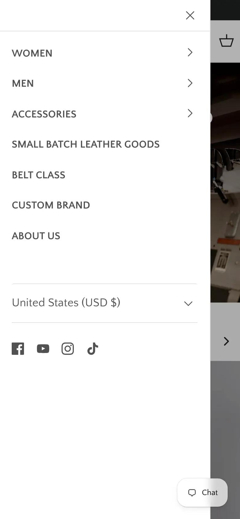
The navigation asks a shopper to choose a gender before it lets them choose a product.
Every page, desktop and mobile
2of 7top-level navigation slots spent on Women and Men
Evidence
The seven top-level items are Women, Men, Accessories, Small Batch Leather Goods, Belt Class, Custom Brand and About Us. Someone who wants a wallet has to guess which gender it lives under. The store's own wallet page is headed “WOMEN WALLETS” and contains the Passport Wallet and the Arida Classic Cardcase, neither of which is gendered — and the Vertical Bifold, the product with the most reviews on the site, is not in it at all.
The change
Lead the menu with what the workshop actually makes — Wallets, Bags, Belts, Aprons, Accessories, Gifts — and move Women and Men to a filter inside each one, alongside colour and price.
CriticalN2
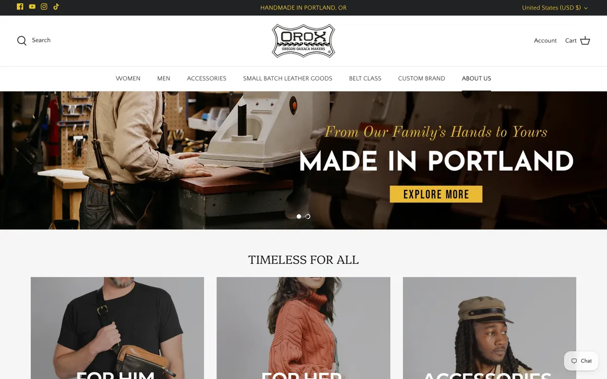
The header takes 217 pixels before a single product appears.
Every page, desktop
217pxof a 900px screen — 24% gone before any content
Evidence
Measured at 1440×900: a 37px announcement bar, a 180px logo band and category row. On the product page that pushes the gallery to 282px and the price to 351px. The header is sticky and reappears on any upward scroll, so it keeps taking that band back for the whole visit.
The change
Collapse to a single 64px band after the first scroll carrying the logo, a search field, account and cart. Show the category row only while the shopper is at the top of the page.
MajorN3
Search is a word you click, not a field you type into.
Every page, desktop and mobile
0search inputs rendered in the header at either viewport
Evidence
No search input renders in the header on the homepage, collection, product or cart pages at 1440×900 or 390×844. Search is a label that opens an overlay, one tap away on a store with 103 products spread over 97 collections. The mobile menu contains no search at all.
The change
Put an always-open input in the header with a placeholder naming real stock — “Search wallets, belts, aprons” — and keep the icon-only version below 700px. Add the same field to the top of the mobile menu.
MinorN4
Three of the seven menu labels do not say what they open.
Every page, desktop and mobile
Evidence
“Small Batch Leather Goods”, “Belt Class” and “Custom Brand” take three of the seven slots. Belt Class is a workshop you attend, Custom Brand is corporate work, and Small Batch is a product line — but nothing in the label tells a first-time visitor which is which.
The change
Rename them for what a shopper is looking for: “Small batch”, “Belt-making classes”, “Branding for business”. Move the two that are not shopping into a second row or the footer.
04Homepage
The homepage has one job the rest of the store cannot do: say who Orox is, in a way that makes a $220 wallet feel obviously worth $220. It currently says the same thing twice and never mentions 1933.
CriticalH1
All three of the homepage's h1 elements are carousel labels.
Homepage, desktop and mobile
3h1s“Timeless for all”, “Best sellers”, “Shop by collection”
Evidence
The page has three h1 elements, all with the class hometitle h4-style: “TIMELESS FOR ALL”, “BEST SELLERS” and “SHOP BY COLLECTION”. Each sits inside a carousel, so the accessible name of the first one reads “Left timeless for all Right” — the previous and next buttons are inside the heading. The brand name, the craft and the year 1933 appear in none of them.
The change
One h1 on the page carrying the actual proposition — “Leather goods made by one family since 1933” — and demote the three section labels to h2, with the carousel buttons moved outside the heading element.
MajorH2
The announcement bar and the headline directly beneath it say the same thing.
Homepage, desktop and mobile
Evidence
The bar reads “HANDMADE IN PORTLAND, OR”. The hero headline 250 pixels below reads “MADE IN PORTLAND”. The store's three strongest commercial facts — free shipping over $500, a limited lifetime warranty, free three-character monogramming on any piece — appear in neither, and the warranty appears nowhere above the footer on any page.
The change
Give the bar the three promises on a rotation: “Free monogramming on every piece · Lifetime warranty · Free US shipping over $500”, each linking to the page that explains it.
MajorH3
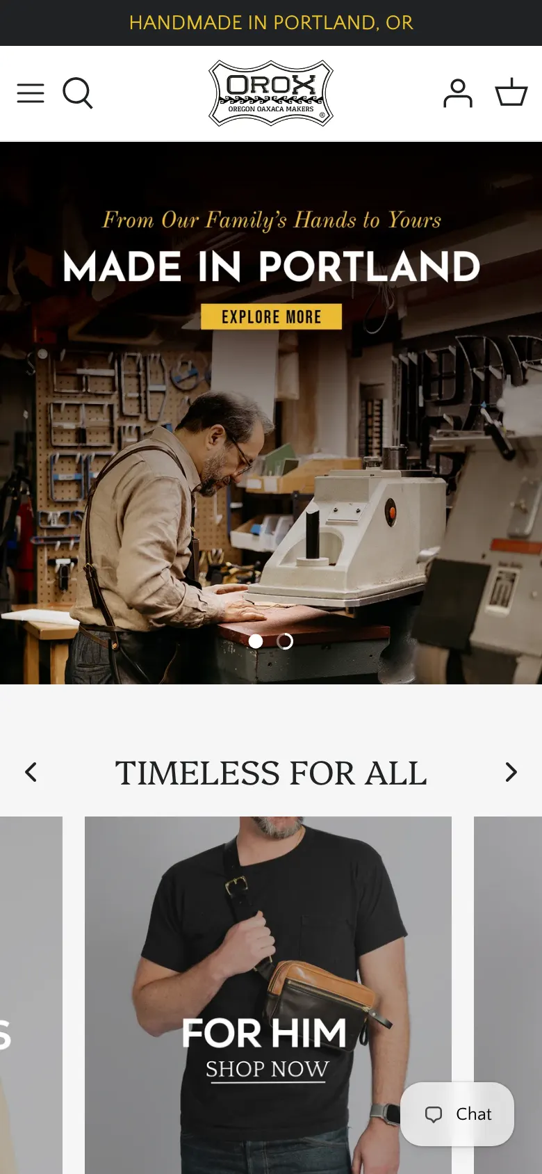
Nothing on the first phone screen can be bought.
Homepage, phone
1,396pxto the first price on the phone homepage — 1.7 screens down
Evidence
At 390×844 the first screen carries the announcement bar, the header, a workshop photograph, the words “Made in Portland” and a button reading “Explore more”. The first price on the page sits at 1,396px. The homepage runs 7,990px on a phone.
The change
Put three real products — name, price and a swatch — inside the first 844 pixels, directly under the hero. Keep the workshop photograph; it is the reason to buy, but it needs something to buy beside it.
MinorH4
The hero button is labelled “Explore more”.
Homepage, desktop and mobile
Evidence
The only call to action on the first screen reads “EXPLORE MORE”. It does not name what it opens, so it competes with nothing and promises nothing. The section heading below it, “TIMELESS FOR ALL”, has the same problem: the three cards under it are For Him, For Her and Accessories.
The change
Name the destination: “Shop wallets” or “See the workshop”. Rename the section for its contents.
MajorH5
The homepage carries no structured data at all.
Homepage
0blocksof JSON-LD on the homepage; product pages have two
Evidence
There are no application/ld+json blocks on the homepage. No Organization, so Google has no machine-readable statement that this business was founded in 1933, where its shop is, or what its logo is. No WebSite block either, which is what produces the search box under a brand's result. Product pages do carry Product and BreadcrumbList, so the theme is capable of it.
The change
Add an Organization block with foundingDate 1933, the Portland address, the logo and the social profiles, plus a WebSite block with a SearchAction pointing at /search.
MajorH6
Ninety-three years of family history are not on the homepage.
Homepage
Evidence
The story pages carry it: Don Felipe Martínez Audelo making custom leather baseball gear for his own team, Los Audelos, in Oaxaca in 1933; his son Don Pepe and Pepe's fourteen children; José starting at eight years old, then six years developing leather goods in Japan from 1991; the name Orox merging Oaxaca and Oregon. On the homepage this is one line of script type over a photograph: “From Our Family's Hands to Yours”.
The change
A dated band between the hero and the products — 1933 Oaxaca, 1991 Japan, today Portland — with one photograph each and a link to the full story. It is the argument for the price, and it is the one thing no competitor can copy.
MinorH7
The meta description runs to 208 characters and opens with a joke.
Homepage, in Google results
Evidence
The description begins “Best-smelling store in Portland, OR.” and runs 208 characters. Google truncates around 155, so the sentence that gets cut is the one listing belts, wallets, handbags and travel bags. The title tag, at 60 characters, is well judged.
The change
Rewrite to under 155 characters, leading with the craft and the guarantee: “Leather bags, wallets and belts handmade in Portland by one family since 1933. Free monogramming, lifetime warranty.”
05Collections and catalogue structure
This is the most expensive problem on the site and the least visible one. The catalogue has been organised the way a spreadsheet grows rather than the way a shopper looks, and it is now splitting the same products across pages with the same name.
CriticalC1
There are 97 collections for 103 products.
Whole store
97collectionsfor 103 published products — 0.94 collections per product
Evidence
The store's own collections endpoint returns 97 published collections; the products endpoint returns 103 published products. Only seven collections are reachable from the top-level menu. The rest are found by luck, by an old link, or by Google.
The change
Cut to roughly twelve shopper-facing collections — Wallets, Cardholders, Bags, Crossbody, Totes, Backpacks, Travel, Belts, Aprons, Home, Gifts, New — and rebuild everything else as filters and tags on those pages. Redirect the retired handles rather than deleting them.
CriticalC2
Eleven collection names exist two or three times over, splitting the same category across parallel pages.
Whole store
25collectionsshare a name with another live collection
Evidence
Three collections are called Accessories, holding 8, 23 and 44 products. Three are called Belts, holding 4, 3 and 3. Three are called Hats, holding 2, 10 and 9. Bags exists twice at 10 and 16 products, Crossbody Bags twice at 11 and 9, Bifolds twice at 7 and 8, plus duplicate Home Goods, Tech Goods, Aprons at Work and Best Sellers. All of them are live. A shopper who lands on /collections/belts sees four belts and has no way to know two more belt pages exist.
The change
Pick one canonical page per category, move every product onto it, and 301 the duplicates to it. Then set a rule: a new collection needs a reason a shopper would ask for it by name.
MajorC3
Product cards show no rating, so thirteen five-star reviews stay hidden until the shopper commits.
Collection and search pages
Evidence
The collection grid shows a photograph, a title, a price and colour swatches. The star rating and review count exist — the Vertical Bifold shows ★★★★★ (13) on its own page — but nothing on the browse page carries them, so the shopper choosing between four wallets has no social proof to choose with.
The change
Add the star row and count under the price on every card. It is a metafield the reviews app already writes; it is a theme change, not a data change.
MajorC4
Forty-five of the 97 collection names are typed in capitals and 52 are not.
Whole store
45of 97collection titles typed in all capitals in the data
Evidence
“BAGS”, “ACCESSORIES” and “BELTS” sit alongside “Backpacks”, “Bag Charms” and “Crossbody Bags”. The capitals are in the stored title, not in CSS, so they carry into page headings, breadcrumbs, search results and Google. Screen readers may read a capitalised word letter by letter.
The change
Store every title in sentence case and apply any capitalisation with text-transform in the theme. It is a one-pass edit and it fixes headings, breadcrumbs and search results at once.
MajorC5
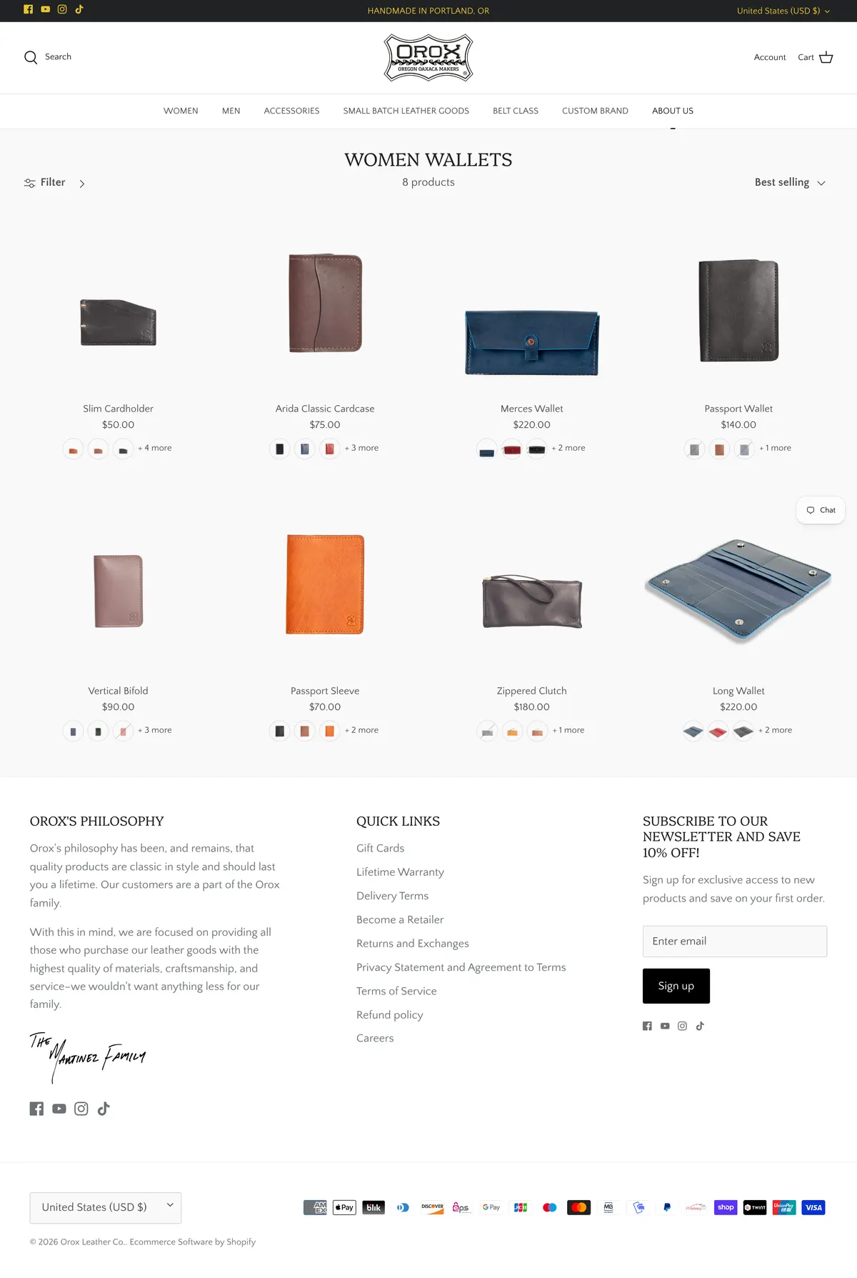
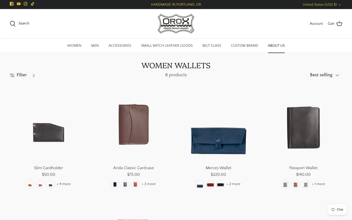
The wallets page is headed “Women wallets” and sells wallets that are not.
/collections/wallets
Evidence
The page renders an h1 of “WOMEN WALLETS”. Its title tag says “Women's Wallets | Leather Wallets & Cardholders | Orox Leather Co.” Its eight products include the Passport Wallet and the Arida Classic Cardcase. Anyone searching for a leather cardholder lands on this page and reads a heading telling them they are in the wrong place.
The change
Rename the page “Wallets and cardholders”, put every wallet on it, and add a gender filter for the shoppers who want one.
MajorC6
Five products have no photograph at all.
Whole store
19of 103products with one image or none; 5 have none at all
Evidence
Across the 103 published products, five have zero images and nineteen have one or fewer. The median product has nine. The Vertical Bifold has twenty-three and the Arida Classic Cardcase nineteen — so the standard exists, it just is not applied evenly.
The change
Set a floor of four images per product: on-white, in-hand for scale, an interior or detail, and one in use. Unpublish anything that cannot meet it until it can.
MinorC7
A 1440-pixel screen shows four products, and the photograph fills about a fifth of its card.
Collection pages, desktop
Evidence
At 1440×900 the wallets page shows four of its eight products above the fold, each photograph floating in a card several times its own height. The grid reads as a gallery rather than a shop.
The change
Tighten the card so the photograph fills most of it, and show four across at a shorter height so eight products land in the first screen.
MinorC8
Collection pages carry no description.
Collection pages
Evidence
The wallets page goes straight from the heading and a product count to the grid. There is nothing about the leather, the construction, the monogramming or the warranty — all of which are written up elsewhere on the site.
The change
Two sentences under each collection heading, naming the material and the guarantee, with a link to the materials page. It helps the shopper and it gives the page something for Google to rank.
06Product pages
The buy area itself is good — swatches, monogramming, Shop Pay, local pickup, a proper added-to-cart panel. The problems are all about distance: how far the shopper has to travel to reach it, and what is missing when they get there.
CriticalP1
The sticky Add to Cart bar renders behind the header, and on desktop the button cannot be clicked.
Product pages, desktop
100vs 400the sticky bar's z-index against the header's
Evidence
The bar is position: fixed at top: 104px with z-index 100. The header is position: sticky with z-index 400 and stands 180px tall, so the bar sits inside it. Asking the browser what is painted at the button's own centre point returns the navigation list, not the button. A scripted click at that point left the cart at zero items. The same click on a 390px screen, where the header is only 69px, added the item — so the bar works on a phone and is dead on a desktop, while still looking clickable.
The change
Give the bar a z-index above the header and dock it to the bottom of the viewport on phones, where it is also in thumb reach. This is a one-line change with a directly measurable effect on desktop add-to-cart rate.
CriticalP2
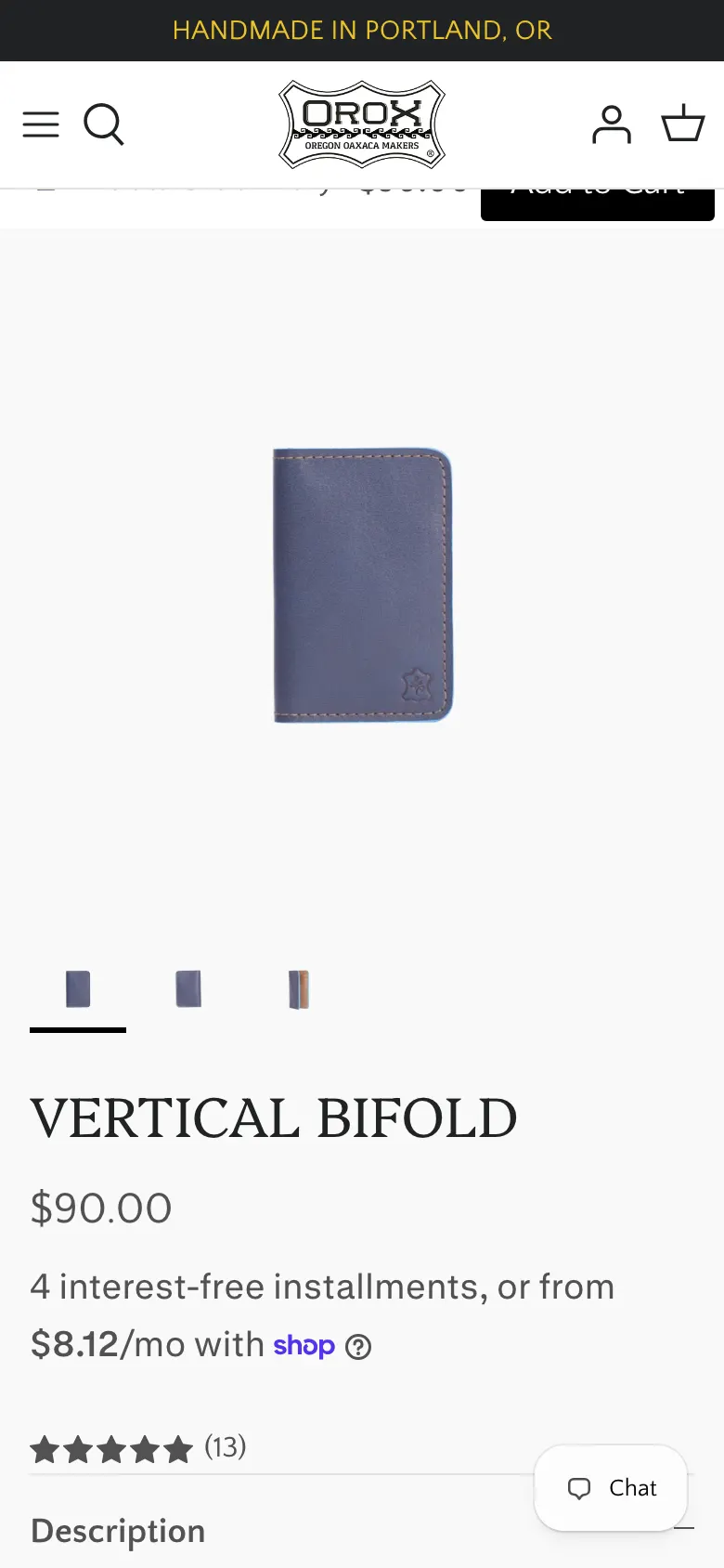
The in-page Add to Cart sits 2.9 screens below the top of the phone product page.
Product pages, phone
2,439pxto the buy button on an 844px screen — 2.9 screens of scrolling
Evidence
Measured on the Vertical Bifold at 390×844: the title is at 581px, the price at 638px, the colour swatches and the Add to Cart button at 2,439px. On desktop the button is at 1,853px on a 900px screen. With the sticky shortcut broken on desktop, that scroll is the only route to a purchase.
The change
Move the colour swatches, the monogram field and the buy button directly under the price, above the description accordions. The gallery can carry on below them.
CriticalP3
The lifetime warranty appears 8.6 screens below the buy button, and shipping is never mentioned at all.
Product pages, desktop and mobile
7,305pxto the first mention of “Lifetime Warranty” on an 8,452px page
Evidence
The words “Lifetime Warranty” first appear at 7,305px, in the footer. The word “shipping” does not appear on the product page at any scroll position. The store gives free US shipping over $500 and a limited lifetime warranty that will add holes to a belt free of charge for as long as you own it. A shopper deciding on a $90 wallet is shown neither.
The change
Three lines directly under the Add to Cart button: free monogramming, lifetime warranty, ships within 72 hours. Each one links to the page that explains it. Everything needed is already written.
MajorP4
Product structured data omits the rating, so thirteen five-star reviews never reach Google.
Product pages
0of 13reviews exposed in the page's Product JSON-LD
Evidence
The Product JSON-LD on /products/vertical-bifold contains name, url, image, description, brand, mpn and offers. It has no aggregateRating and no review — while the page itself displays ★★★★★ (13) with photographs from verified buyers. The stars cannot appear in a search result that has no rating in its markup.
The change
Add aggregateRating and a review sample to the Product block from the reviews app's metafields. It is the cheapest click-through gain available on the whole store.
MajorP5
Materials and Dimensions are collapsed by default on a product whose whole argument is the material.
Product pages
Evidence
Four accordions sit at 1,459–1,580px: Description is open, Features, Materials and Dimensions are closed. The brand's own materials page describes oil-tanned leather from “the best tanneries in the world” and a Luster line that is hand-polished piece by piece. On the product page that is behind a click, and the shopper has to know to look.
The change
Open Materials by default and put a one-line summary — the leather name and its behaviour over time — directly beside the price.
MajorP6
Thirty-seven of 103 products have a description shorter than 200 characters.
Whole store
37of 103products with under 200 characters of description
Evidence
Measured across the products endpoint with tags stripped: the median description is 349 characters, and 37 products fall under 200. The Vertical Bifold's 618 characters explain the RFID film, the eight card slots and how waxy leather takes a shine — which is exactly the level the rest of the catalogue needs.
The change
Write the thirty-seven to the Vertical Bifold's standard: what it holds, what leather it is, what it does over ten years. Prioritise by revenue.
MinorP7
Three thumbnails show for a product that has twenty-three photographs.
Product pages, phone
Evidence
The phone gallery renders three thumbnails under the main image. The Vertical Bifold has twenty-three product images and twenty-six in the gallery, including every colour and the interior. A shopper choosing between Navy and Cherry has to swipe blind.
The change
Show a scrollable thumbnail strip with a count — “1 of 23” — and filter it to the selected colour when a swatch is chosen.
MinorP8
Free monogramming is presented as a form instruction, not as something the brand offers.
Product pages
Evidence
The personalisation field is labelled “ENTER 3 COMPLEMENTARY INITIALS OR NUMBERS”. It is free, it is permanent, it is stamped by hand, and it is one of the few things a factory competitor cannot match. The label reads like a validation rule.
The change
Lead with the offer — “Free hand-stamped monogram, up to three characters” — and show the stamp on the leather in a photograph beside the field.
07Search
Search is how a returning customer buys their second wallet. On this store it returns products for words that mean nothing, and it never admits that it found nothing.
CriticalS1
The store has no no-results state; nonsense queries return products.
/search, every query tested
22resultsreturned for the query “zzqqxx”
Evidence
“zzqqxx” returns “We found 22 results”, led by the Zippered Clutch, a Classic Belt and the Classic Bifold. “purple unicorn” returns 9. “asdfgh” returns 5. “qwertyuiop” returns 2. Not one of the seven queries tested produced a no-results message. A shopper who mistypes “bifold” is shown a page of confident, irrelevant results and has no way to tell that their search failed.
The change
Set a relevance floor so weak matches return nothing, and build a real empty state: the query repeated back, three spelling suggestions, the six best sellers and a link to contact the shop.
MajorS2
Searching “briefcase” returns 58 results for a category that contains one product.
/search
58vs 1search results against the briefcases collection's real contents
Evidence
“briefcase” returns 58 results. The store's own briefcases collection holds one product, the Nuntius X at $950. It is correctly the first result — and then results two and three are the Travelers Bifold and the Classic Bifold, both wallets. Whatever is matching is matching far too loosely to be useful.
The change
Restrict matching to titles, product types and tags rather than full descriptions, and surface matching collections above the product grid so “briefcase” offers the briefcases page first.
MinorS3
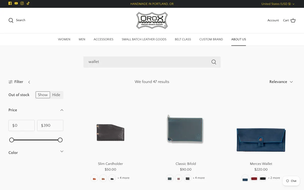
The results page is headed “Search” and never repeats the query.
/search
Evidence
The h1 reads “SEARCH”. The query appears only in the browser tab: “Search: 47 results found for "wallet"”. On the page itself the shopper has to trust that the box did what they asked.
The change
Head the page with the query and the count — “47 results for wallet” — and keep the term in the search field so it can be edited rather than retyped.
08Cart and checkout
Adding to the cart is handled well. What is missing is the one number that reliably raises order value, and a way out of an empty cart.
MajorCT1
The free shipping threshold is never shown while the shopper can still act on it.
Cart and product pages
$500free shipping threshold, against a $90 median product price
Evidence
Free US shipping over $500 is stated on the delivery page and nowhere else. The added-to-cart panel says only “Excl. shipping”. The median product is $90, so most shoppers are several hundred dollars short and are never told by how much — which is precisely the moment that number changes behaviour.
The change
Put a progress line in the cart and the added-to-cart panel: “You're $410 from free shipping”, with three suggested products under $500 that would close the gap.
MajorCT2
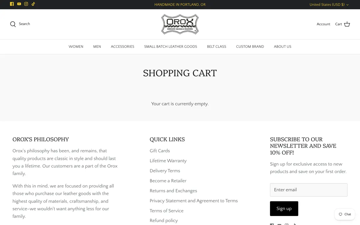
The empty cart is one sentence with nothing to click.
/cart
Evidence
With nothing in it, the cart page renders “SHOPPING CART” and “Your cart is currently empty.” That is the whole of the main region — no products, no collections, no search, no link back. The same is true of the 404 page, which offers “You may want to return to the home page or try a search” without giving a search field to do it in.
The change
Make both pages useful: six best sellers, the main category links and a search field. An empty state is a place to start shopping, not a receipt for failure.
CriticalCT3
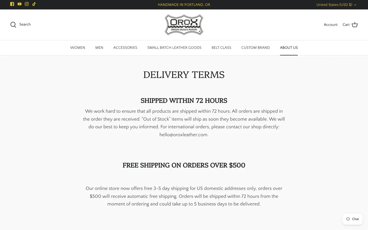
The delivery page still lists Christmas shipping deadlines from 2022.
/pages/delivery
2022the only year that appears anywhere on the delivery page
Evidence
The page carries nine dated cut-offs under “X-Mas Shipping Deadlines for US Shipments” — USPS First Class 16 December 2022, FedEx Ground 14 December 2022, UPS Ground 13 December 2022, and six more. 2022 is the only year that appears on the page. This is the page a gift buyer with a deadline is sent to, and it has been wrong for four Christmases.
The change
Remove the dated block and replace it with a live cut-off driven by the current year, or a single sentence: “Order by [date] for delivery before 25 December.” Put an owner and a calendar reminder against it.
09Footer and contact
The footer is where a shopper goes when they have a question they cannot answer on the page. On this store it is where the currency list lives.
MajorF1
Neither of the store's two published email addresses is in the footer, and nor is a phone number or the shop address.
Every page
0email addresses in a footer carrying 193 links
Evidence
The footer contains 193 links and not a single “@”. The FAQ page gives sales@oroxleather.com, the returns page gives hello@oroxleather.com, and the store has a physical Portland shop that also does local pickup — the product page offers collection at Chinatown with a 2–4 day estimate. None of that reaches the footer.
The change
A contact block: the shop address, opening hours, one email address and a phone number. For a workshop selling heirloom goods, being reachable is part of the product.
MinorF2
Local pickup is offered at “Chinatown” with no city attached.
Product pages
Evidence
The buy area reads “Pickup available at Chinatown — usually ready in 2–4 days”. Portland's Old Town Chinatown is where the shop is, but a shopper in another state reads a neighbourhood name with no city and cannot tell whether it is near them.
The change
Name it in full — “Orox Leather Co., Old Town Chinatown, Portland OR” — and link it to a page with the address, hours and a map.
10Typography and colour
This is the healthiest area of the store. The type pairing is deliberate, the sizes are generous and every colour pair passes. The findings here are about capitals and consistency, not legibility.
MajorT1
Headings are typed in capitals in the content instead of styled in the theme.
Collection, cart, search and 404 pages
Evidence
“WOMEN WALLETS”, “SHOPPING CART”, “SEARCH”, “404 PAGE NOT FOUND” and 45 of the 97 collection titles are stored in capital letters rather than set that way in CSS. That makes them impossible to restyle, inconsistent with the other 52 titles, and liable to be read out letter by letter by some screen readers.
The change
Store everything in sentence case and apply capitals with text-transform where the design wants them. One data pass, and every heading, breadcrumb and search result comes right together.
MinorT2
Body text is set at 19px with no size step between the body and the section headings.
Every page
Evidence
Body copy is Quattrocento Sans at 19px; the section headings are Platypi at 28px in weight 300. A 1.47 ratio between body and heading, with the heading set lighter than the text under it, gives the page very little visible hierarchy — one reason the homepage reads as a stack of equal-weight bands.
The change
Open the scale: keep body at 18–19px and take section headings to 34–40px at a heavier weight. The two families are well chosen and worth keeping.
11Performance
Every script is a tax on the phone of someone standing in a shop deciding whether to buy. The product page is currently paying that tax 342 times.
CriticalPF1
The product page makes 342 requests, 206 of them to other companies' servers.
Product pages, desktop and phone
206of 342requests going to third-party hosts; 135 requests are scripts
Evidence
Measured on the Vertical Bifold: 342 requests, of which 135 are JavaScript and 206 go to hosts other than oroxleather.com. The homepage runs 257 requests with 100 scripts and 125 third-party. Sixty per cent of a product page load is work done for someone other than the shopper.
The change
Audit the installed apps against revenue, remove what is not earning, and defer what stays until after first interaction. Start by listing every third-party host and naming the app behind it — anything unaccounted for is free speed.
MajorPF2
The phone product page is 8,452 pixels tall and the phone homepage is 7,990.
Product and home pages, phone
8,452pxthe phone product page — ten screens of scrolling
Evidence
At 390×844 the product page runs 8,452px, or ten screens; the homepage runs 7,990px. The reviews, the warranty and the related products are all in the last third, so every shopper who wants social proof pays for the full page.
The change
Move reviews up to just below the buy area, and lazy-render the related products and footer bands so the first three screens are all the browser builds up front.
12Accessibility
Colour and text size are fine here — better than most stores this size. What is missing is structure: the markup that tells assistive technology what a thing is and whether it matters.
CriticalA1
Almost every image on the store is marked as decorative.
Every page
46 of 47homepage images with alt="", which tells a screen reader to skip them
Evidence
On the homepage 46 of 47 images carry an empty alt attribute. On the wallets collection it is 58 of 59, and on the product page 46 of 48, with one image carrying no alt attribute at all. An empty alt is an instruction to skip — so a shopper using a screen reader is told there is nothing worth describing on a page made entirely of product photographs.
The change
Write real alt text for every product and workshop image: what the piece is, its colour and what the photograph shows. Reserve alt="" for genuine decoration such as background textures.
CriticalA2
The homepage has no header, nav or footer landmark.
Homepage, desktop and phone
1of 4landmark regions present — main only
Evidence
Measured at both viewports: the homepage has a main element and no header, no nav and no footer element. The navigation, the logo band and the footer are all plain divs. Screen reader users navigate by landmark; on this page there is one place to jump to and it is the whole page.
The change
Wrap the header band in header, the menus in nav with distinct labels, and the footer in footer. It is a markup change with no visual consequence at all.
MajorA3
Twenty-six of the phone homepage's interactive elements are smaller than 44 pixels, and one of them is the buy button.
Every page, phone
26of 122visible links and buttons under 44px on the phone homepage
Evidence
Counting only elements that are actually visible at 390×844: 26 of the homepage's 122 links and buttons fall under 44px, and 24 of those are under 30px — the social icons at 20×20, the carousel dots at 20×20. The product page is the same count out of 82, and its list includes the sticky bar's Add to Cart button at 126×41 and the review link at 358×26.
The change
Set a 44px minimum hit area on every interactive element using padding or a pseudo-element, so a 20px carousel dot can stay 20px while being tappable. Start with the buy button and the swatches.
MinorA4
The 404 page suggests a search and does not provide one.
/404 and any broken link
Evidence
The page reads “404 PAGE NOT FOUND — You may want to return to the home page or try a search.” There is no search field on the page and no links other than the header. With 97 collections in play and duplicates due to be merged, broken links are about to become more common, not less.
The change
Add a search field, the six main categories and four best sellers. Do this before the collection merge, so the redirects have somewhere friendly to fail to.
13Where to start
Three of the forty-three, chosen because they cost the least to do and return the most. Everything else can wait behind them.
Fix the sticky buy button
P1 is a one-line z-index change that restores a working shortcut to purchase on every desktop product page. Nothing else on this list has a better ratio of effort to revenue, and it can ship this week.
Merge the duplicate collections
C1 and C2 are the reason the store feels bigger and emptier than it is. Twenty-five collections sharing names with each other means a shopper looking at belts is seeing a third of them. Merging is a day of work and it makes every later navigation decision simpler.
Put the promises next to the price
P3, H2 and CT1 are the same fix seen from three pages: the lifetime warranty, the free monogram and the shipping threshold are already written and are simply not where the decision happens. Moving them costs nothing and is the difference between a $90 wallet and a $90 wallet you keep forever.