UX research
Who shops at Orox, what they are trying to do, where the store stops them, and how five other leather retailers handle the same moments.
01Five shopping modes
These are five ways of arriving at the same store, not five demographics. Each one wants a different thing from the same product page. Every frustration listed traces to a numbered finding in the design audit.
Dana, buying a gift with a deadline
38, lives in Beaverton, buying a retirement present for a colleague of eleven years. Shopping on a phone at 9pm on a Tuesday with about a week before the party. Has never bought leather goods before and has no idea what separates $50 from $220.
I want something that looks like it cost more than it did, with their initials on it, and I need to know it will get here by Friday week.
Device
iPhone, evening, at home
Budget
$100–$180
Deadline
Nine days
Knows about leather
Nothing
What they came to do
- Find something under $180 that reads as a serious present
- Confirm the monogram is free and get the initials right
- Know the delivery date before paying, not after
Where the site stops them
- The first phone screen has nothing to buy — the first price is 1,396px down
- The word “shipping” never appears on the product page, so the delivery date is unknowable
- Free monogramming is written as a form instruction, so it never reads as a feature
- Gift-ready framing exists in three separate “Gifts under” collections there is no way to find
What the redesign gives them
- Three real products with prices in the first screen
- “Free hand-stamped monogram” stated as an offer, with a photograph of the stamp
- Shipping window and the free-shipping threshold under the buy button
- One gifts page with price bands instead of three parallel ones
Marcus, comparing three makers before committing
45, Chicago, replacing a wallet carried for nine years. Has Ashland Leather and Billykirk open in other tabs. Reads about tanneries for fun and will not buy until the page says what leather it is and what happens when it wears.
Tell me the tannery, tell me how it ages, and tell me what you do when the stitching goes. Then I'll spend the money.
Device
Desktop, three tabs open
Budget
$90–$250
Deciding on
Material and repair policy
Time to decide
Two or three sessions
What they came to do
- Read the material spec before anything else
- Understand the warranty and what it excludes
- See the piece from every angle in the colour they picked
Where the site stops them
- Materials and Dimensions are collapsed by default, 1,459px down
- “Lifetime Warranty” first appears at 7,305px, in the footer
- The sticky buy bar is behind the header on desktop, so the click does nothing
- Thirty-seven products have under 200 characters of description
What the redesign gives them
- Leather name and behaviour beside the price, Materials open by default
- Warranty, monogram and shipping stated at the buy point
- A sticky bar that works, docked above the header instead of under it
- A thumbnail strip that filters to the colour they chose
Alma, coming back for a third piece
52, Portland, owns a Merces Wallet and a belt and has been into the Chinatown shop twice. Knows exactly what to buy, arrives by search, and expects to be out in four minutes.
I know what I want. I just need the site to let me buy it.
Device
Phone, lunch break
Budget
$150–$400
Arrives by
Search box
Already trusts
The brand completely
What they came to do
- Search a product name and land on it
- Pick a colour already decided on
- Check whether it is in stock for pickup at the shop
Where the site stops them
- There is no search field in the header — search is a label that opens an overlay, and the mobile menu has none at all
- Search returns 22 products for “zzqqxx”, so a typo returns confident nonsense with no way to tell it failed
- Pickup is offered at “Chinatown” with no city and no address
- Twenty-six visible controls on a phone page are under 44px, including the sticky bar's own Add to Cart at 126×41
What the redesign gives them
- An always-open search field with a real placeholder
- A no-results state that repeats the query and offers spellings
- Pickup named in full, with hours and a map
- Swatches with a 44px hit area
Ray, buying aprons for a working kitchen
34, runs a six-person restaurant kitchen in Seattle. Wants durable aprons the kitchen will not destroy in a season, and may want the restaurant's name on them. Ordering during a prep shift, with about four minutes and one hand free.
Six of them, same colour, with our name on. Who do I actually talk to about that?
Device
Phone, on a prep bench
Budget
$1,500–$2,500 for six
Needs
Bulk pricing and branding
Deciding on
Whether anyone will answer
What they came to do
- Compare the two tradesman aprons and pick one
- Find out about branding six of them with a logo
- Reach a human before ordering $2,000 of stock
Where the site stops them
- Two collections are called Aprons at Work, so only part of the range is visible
- “Custom Brand” is a menu label that does not say it means branding for a business
- The footer has 193 links and no email address, no phone and no shop address
- A $2,000 order clears the $500 free-shipping threshold easily and is never told it exists
What the redesign gives them
- One aprons page with the whole range and a trade enquiry block
- “Branding for business” named for what it is, with a form and a response time
- A contact block in the footer with an address, hours and a phone number
- Free shipping confirmed in the cart the moment the order crosses $500
Tomás, shopping with a screen reader
41, Oakland, has bought leather goods online for years and uses VoiceOver on both phone and laptop. Navigates by landmark and heading first, and abandons a store that offers neither.
If the images are all marked decorative, I'm being told there's nothing here worth describing.
Device
VoiceOver on macOS and iOS
Budget
$80–$200
Navigates by
Landmarks, then headings
Leaves when
Structure is missing
What they came to do
- Jump to the navigation, then to the product list
- Hear what each product photograph actually shows
- Reach the buy button without traversing the whole page
Where the site stops them
- The homepage has no header, nav or footer landmark — only main
- 46 of the homepage's 47 images carry alt="", which instructs the reader to skip them
- The page's three h1 elements are carousel labels, and the first announces as “Left timeless for all Right”
- Headings stored in capitals may be read out letter by letter
What the redesign gives them
- Real header, nav and footer landmarks — a markup change with no visual cost
- Alt text describing the piece, the colour and what the photograph shows
- One h1 stating the proposition, with the carousel buttons outside it
- Sentence-case headings styled with text-transform
02Task flows, today and proposed
One journey per shopping mode, followed end to end. The left column is what the live store does; the right is what the redesign does instead. Where the design cannot fix something, it says so.
Dana, buying a gift with a deadline
Buying a monogrammed gift on a phone, nine days out
The highest-intent visit the store gets at Christmas, and the one the current homepage is least built for.
| Step | On the site today | In the redesign |
|---|---|---|
| Lands on the homepage | A workshop photograph, “Made in Portland”, and a button reading “Explore more”. No product, no price. | The same photograph, plus three products with names, prices and swatches inside the first 844px. |
| Looks for something around $150 | Opens the menu and is asked to choose Women or Men before any product appears. | Opens Gifts, filters by price band, sees everything from $50 to $200 on one page. |
| Checks whether it can be personalised | Scrolls 2,439px on the product page to a field labelled “ENTER 3 COMPLEMENTARY INITIALS OR NUMBERS”. | Reads “Free hand-stamped monogram, up to three characters” beside the price, with the stamp photographed. |
| Checks it will arrive in time | The word “shipping” does not appear on the product page. The only page that says is /pages/delivery, whose Christmas cut-off dates are from 2022. | “Ships within 72 hours · free over $500” under the buy button, with an arrival window for the delivery postcode. |
| Adds to cart | The added-to-cart panel shows the item and “Excl. shipping”. | The same panel, plus “You're $410 from free shipping” and three suggestions that would close the gap. |
Today Dana leaves at the shipping step, because the one fact needed is the one fact the product page never states. Every other part of this journey already works.
Marcus, comparing three makers before committing
Comparing an Orox wallet against two other makers on desktop
The visit that decides whether Orox is a leather brand or a Portland souvenir.
| Step | On the site today | In the redesign |
|---|---|---|
| Opens the product page | 217px of header, then the gallery at 282px and the price at 351px. Description open, Materials closed. | A 64px header after the first scroll, the leather named beside the price, Materials open by default. |
| Looks for the material spec | Finds a collapsed Materials accordion at 1,520px. The tannery detail lives on a separate page nothing links to from here. | Leather name and ageing behaviour beside the price, linked to the full materials page. |
| Looks for the guarantee | “Lifetime Warranty” first appears at 7,305px on an 8,452px page — in the footer. | Warranty stated under the buy button, linked to the page that lists what it covers. |
| Decides, and clicks the sticky Add to Cart | Nothing happens. The bar's z-index is 100 against the header's 400, so the click lands on the navigation. | The bar sits above the header and the click adds the item. |
| Checks what other buyers said | Thirteen five-star photo reviews sit in the last third of an 8,452px page, and none of them reaches Google. | Reviews directly under the buy area, and aggregateRating in the Product markup so the stars show in search. |
Marcus loses this comparison at the sticky button — a click on something that looks like a buy button does nothing. Ashland Leather, open in the next tab, puts Wallets first in its navigation and shows 72 reviews on its homepage.
Alma, coming back for a third piece
A returning customer trying to buy a known product in four minutes
The cheapest revenue in the store, and the flow with the most friction per second.
| Step | On the site today | In the redesign |
|---|---|---|
| Reaches for search | There is no field in the header. She taps “Search” to open an overlay; the mobile menu has no search at all. | An always-open field with the placeholder “Search wallets, belts, aprons”. |
| Types the product name, with a typo | The store returns products for anything. “zzqqxx” returns 22. There is no way to tell whether the spelling or the shop is wrong. | A no-results state that repeats the query, suggests three spellings and shows six best sellers. |
| Picks a colour | 26 of 122 visible phone controls are under 44px, 24 of them under 30px. Mis-taps are routine. | 44px hit areas on every swatch, with the gallery filtered to the chosen colour. |
| Checks it can be collected from the shop | “Pickup available at Chinatown — usually ready in 2–4 days.” No city, no address, no hours. | “Collect at Orox Leather Co., Old Town Chinatown, Portland” with hours and a map. |
Alma gets there, already knowing the brand and willing to forgive it. A first-time visitor making the same four mistakes does not come back.
Ray, buying aprons for a working kitchen
A trade buyer pricing six branded aprons
The largest order in this set, from the shopper the site gives the least help to.
| Step | On the site today | In the redesign |
|---|---|---|
| Searches “apron” | Seventeen results, mixing the two tradesman aprons with belts and a t-shirt. | The Aprons collection offered above the product grid, with the full range on one page. |
| Compares the two aprons | They sit across two collections both named Aprons at Work, so only one may ever be seen. | One aprons page with a comparison of weight, pockets and price. |
| Looks for bulk and branding | “Custom Brand” is in the menu but the label does not say it means branding for a business. | “Branding for business” with a form, a minimum order and a stated response time. |
| Tries to reach a person | The footer has 193 links, no email address, no phone number and no shop address. | A contact block with the Portland address, hours, one email and a phone number. |
Ray abandons before the enquiry, because a $2,000 order to a maker with no phone number is not a risk a kitchen takes. The site cannot fix the lead time, but it can state it.
Tomás, shopping with a screen reader
Reaching a product with VoiceOver
The flow that decides whether the store is usable at all for a group of shoppers, rather than merely inconvenient.
| Step | On the site today | In the redesign |
|---|---|---|
| Lists the page's landmarks | One: main. There is no header, no nav and no footer element on the homepage. | Four, each labelled — the same visual page, different markup. |
| Lists the headings | Three h1s, all carousel labels. The first announces as “Left timeless for all Right” because the carousel buttons are inside the heading. | One h1 stating what Orox is, with the section labels as h2 and the buttons outside them. |
| Browses the product photographs | 46 of 47 homepage images carry alt="", so the reader skips every one. | Alt text naming the piece, the colour and what the shot shows. |
| Reaches the buy button | On a phone, 2,439px of unlabelled content between the price and the button. | Buy controls directly under the price, with the gallery below. |
Tomás cannot form a picture of the page today. Every fix in this flow is markup and copy — none of them changes a single pixel of the design the family already paid for.
03Five stores measured
One benchmark in the same city, two peers of the same size, one aspirational leather brand and one adjacent heritage retailer. Each was opened at 1440×900 on the same day as the Orox review, and the notes are from what was on the screen.
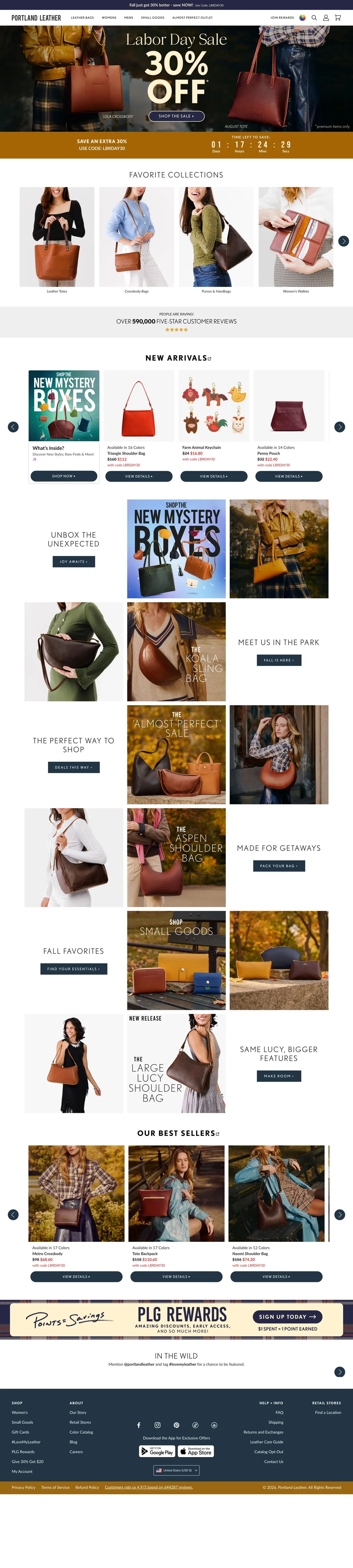
Portland Leather Goods
The benchmark — same city, same craft claim, vastly larger
- A 64px header — under a third of Orox's 217px — with an open search field in it
- The menu opens with Leather Bags, then Womens, Mens, Small Goods: the product comes before the person
- Claims 644,287 reviews on the homepage; Orox shows none anywhere on its homepage
- Organization and WebSite structured data present, and 15 of 276 images carry empty alt against Orox's 46 of 47
- Twelve nav elements and a full set of landmarks — this is a store built to be navigated, not browsed
Worth borrowing The review count on the homepage. It is the single fastest way to convert a stranger, and Orox has thirteen five-star photo reviews on one wallet alone that no visitor to the homepage ever sees.
Ashland Leather
The closest peer — a small family workshop of the same size and price
- The navigation reads Wallets, Belts, Bags, Accessories — exactly the structure this proposal recommends for Orox
- Shows “72 Reviews” on the homepage; a workshop of comparable size making the count work for it
- Search field open in the header, one h1, and a full set of landmarks
- 4 of 69 images carry empty alt — 6%, against Orox's 98%
- Header runs 172px, so a tall header is not unusual in this trade; Orox's 217px is still the tallest measured
- A four-part trust strip sits under the hero — Made in the USA, 100% Horween Leather, Built to last, 100% Satisfaction Guarantee — and star ratings appear on every product card
Worth borrowing That a workshop this size can lead its navigation with four product words. Ashland has no more staff than Orox and it does not ask anyone to pick a gender first.

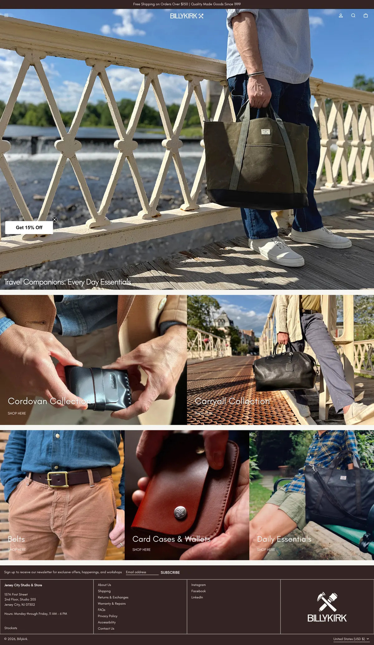
Billykirk
The close peer — two brothers, handmade American leather, similar catalogue
- The top bar carries a promise, not a location: “Free Shipping on Orders Over $150 | Quality Made Goods Since…”
- A 58px header, the slimmest in this set — a quarter of Orox's
- The homepage is 2,480px; Orox's is 5,987px on desktop and 7,990px on a phone
- Leads with editorial collections — Travel Companions, Cordovan Collection — rather than gender
- Four h1 elements and 26 of 31 images with empty alt: a peer with the same structural habits as Orox
Worth borrowing The top bar as a promise rather than a place. Orox says “Handmade in Portland, OR” directly above a headline that says “Made in Portland”, and spends the slot twice.
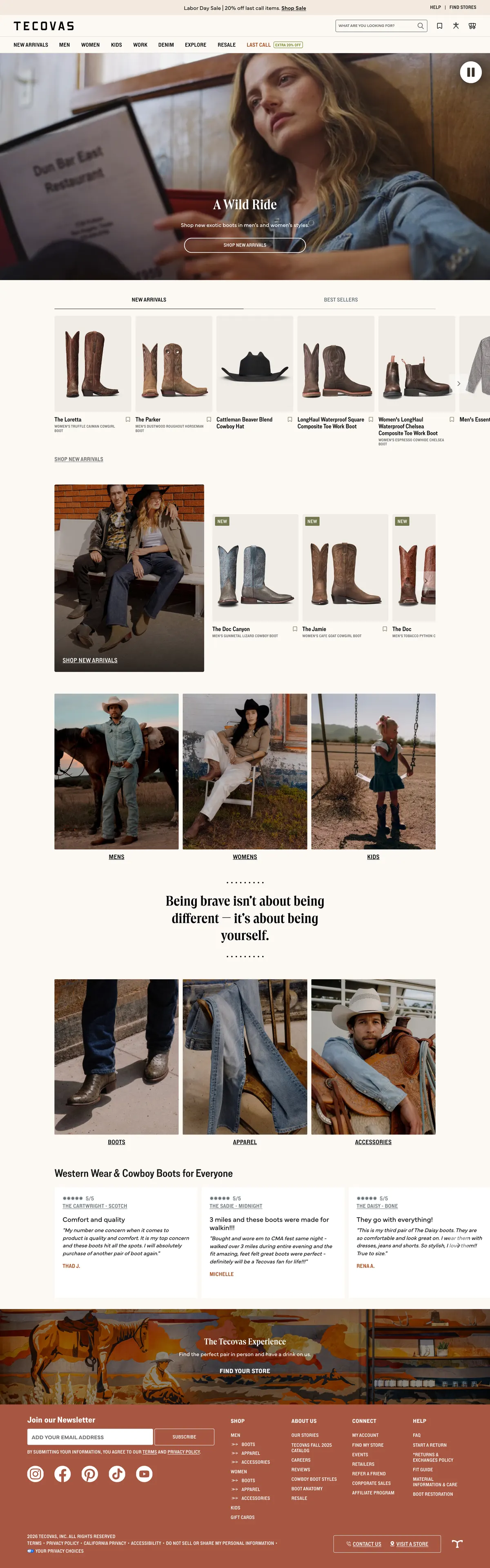
Tecovas
The aspirational one — a heritage leather story told at national scale
- Search placeholder is a question — “What are you looking for?” — not the word Search
- “Help” and “Find Stores” sit in the top bar; Orox has a physical Portland shop and links to it from nowhere
- Header 156px, homepage 4,602px, 145 scripts — a much larger business running lighter pages than Orox's product page
- One h1, full landmarks, Organization structured data
- Sells a founder story at scale without ever making the customer read it before they can shop
Worth borrowing Putting the shop in the top bar. Orox's Chinatown store is a differentiator that costs nothing to link, and is currently mentioned only as a pickup option with no city attached.
Filson
The adjacent one — Pacific Northwest heritage, lifetime guarantee, much bigger
- The top bar carries four things a shopper needs: Stores, Events, Free Shipping Over $99, Customer Care
- The navigation is deep and entirely product-led — Outerwear, Waxed Jackets, Wool Jackets, Vests
- The heaviest page measured here at 516 requests, so Orox's 342 on a product page is not an outlier — but Filson is a far larger catalogue
- Organization structured data present; no h1 on the homepage at all, so even the big ones get this wrong
- Made in USA gets its own nav item — the provenance is merchandised, not just stated
Worth borrowing Merchandising the provenance. Filson makes “Made in USA” a place you can shop. Orox's equivalent — four generations, Oaxaca to Oregon, 1933 — is stronger and lives on a page nobody is sent to.

04Side by side
Ten things a shopper can see without reading a line of code, measured on all six stores on 7 September 2026.
| What a shopper can see | Orox Leather Co. | Portland Leather Goods | Ashland Leather | Billykirk | Tecovas | Filson |
|---|---|---|---|---|---|---|
| Search field open in the header | No | Yes | Yes | Yes | Yes | Yes |
| Navigation leads with products, not gender | No | Yes | Yes | Yes | Yes | Yes |
| Header height at 1440×900 | 217px | 64px | 172px | 58px | 156px | n/a |
| Shipping promise in the top bar | No | Promo code | No | Over $150 | Sale banner | Over $99 |
| Review count on the homepage | No | 644,287 | 72 | No | No | No |
| Exactly one h1 on the homepage | No | Yes | Yes | No | Yes | No |
| Header, nav and footer landmarks | No | Yes | Yes | Yes | Yes | Partial |
| Images with real alt text | 1 of 47 | 261 of 276 | 65 of 69 | 5 of 31 | 16 of 31 | 61 of 118 |
| Organization structured data | No | Yes | No | No | Yes | Yes |
| Script requests on the homepage | 100 | 243 | 148 | 132 | 145 | 157 |
What all five do that Orox does not
- All five have a search field open in the header. Orox has none, at either viewport.
- All five lead their navigation with product categories. Orox leads with Women and Men.
- Three of the five state a shipping or service promise in the top bar. Orox uses the slot to repeat the headline directly beneath it.
- Two of the five put a review count on the homepage. Orox has thirteen five-star photo reviews on a single wallet and shows none of it on the homepage.
- Four of the five carry proper header, nav and footer landmarks and real alt text on most images. Orox has one landmark and one described image in forty-seven.
05Pain points, ranked
The synthesis, ordered by what each one costs the business rather than by how hard it is to fix. The codes in the first column are the audit findings behind each row.
| Pain point | Who it hits | Evidence | What it costs | The fix |
|---|---|---|---|---|
| The desktop buy shortcut is broken P1 | Marcus, Alma | The sticky bar's z-index is 100; the header's is 400 and it stands 180px tall. A click at the button's centre returns the navigation list, and a scripted click left the cart at zero. | Every desktop shopper who uses the shortcut instead of scrolling loses the sale silently. The button looks live, so nobody reports it. | Raise the bar above the header; dock it to the bottom on phones. |
| The catalogue is split across duplicate collections C1, C2, C5 | Dana, Alma, Ray | 97 collections for 103 products, with 25 collections sharing a name with another live collection. Three Accessories pages hold 8, 23 and 44 products; three Belts pages hold 4, 3 and 3. | A shopper on the belts page sees a third of the belts. Google splits its ranking across near-identical pages, and merchandising effort is spread over pages nobody visits. | Merge to about twelve canonical collections with filters; redirect the rest. |
| The reasons to buy are not where the decision is made P3, H2, CT1 | Dana, Marcus, Ray | “Lifetime Warranty” first appears at 7,305px on an 8,452px product page. The word “shipping” never appears on it. Free shipping over $500 is stated only on the delivery page. | The three things that justify the price are invisible at the moment the price is being judged. This is the gap between a $90 wallet and a $90 wallet you keep for thirty years. | Three lines under the buy button; the promises in the announcement bar; a free-shipping progress line in the cart. |
| The navigation asks for a gender before a product N1, C5 | Dana, Marcus, Alma | Two of seven top-level slots are Women and Men. The wallets page is headed “WOMEN WALLETS” and contains unisex products. All five competitors lead with product categories. | Every shopper pays a guess before they can browse, and half of them guess into a page that excludes the product they wanted. | Product-led menu; gender as a filter. |
| Search cannot say that it found nothing S1, S2, S3 | Alma, Ray | “zzqqxx” returns 22 products; “purple unicorn” returns 9. No query tested produced a no-results message. “briefcase” returns 58 results for a collection holding one product. | The returning customer — the cheapest revenue in the store — is the heaviest user of search, and search is where the store is least honest with them. | A relevance floor, a real empty state, and collection matches above the product grid. |
| The store has almost no structure for assistive technology A1, A2, A3, H1 | Tomás | One landmark on the homepage, three h1 elements that are all carousel labels, 46 of 47 images marked decorative, and 26 of 122 visible phone controls under 44px. | A group of shoppers cannot use the store. Contrast already passes everywhere, so this is close to free to fix — and it is a legal exposure as well as a lost customer. | Landmarks, one h1, real alt text, 44px hit areas. |
| The strongest thing the brand owns is not on the homepage H6, H1 | Dana, Marcus | Ninety-three years, four generations, Oaxaca to Japan to Oregon, all written up on the story pages. On the homepage it is one line of script type: “From Our Family's Hands to Yours”. | Without it, a $220 wallet is competing on price with a factory. With it, it is competing with nobody. | A dated band on the homepage — 1933, 1991, today — linking to the full story. |
| The phone homepage sells nothing in its first screen H3, H4 | Dana | At 390×844 the first screen is a photograph, a headline and a button reading “Explore more”. The first price is 1,396px down, on a homepage that runs 7,990px. | Most traffic is phone traffic, and the most expensive screen in the store is currently spent on a statement the announcement bar has already made. | Three real products with prices inside the first screen; name the button for its destination. |
| There is no way to reach the workshop F1, F2 | Ray, Dana | The footer holds 193 links and no “@”, no phone number and no address. Two email addresses exist on the FAQ and returns pages. Pickup is offered at “Chinatown” with no city. | The trade enquiry never arrives, and the gift buyer with a deadline has no way to ask whether it will make it. | A contact block with the address, hours, one email and a phone number. |
06What the redesign must answer
Four priorities the homepage redesign is built against. Everything on the redesign page traces back to one of them.
Put something to buy, and a reason to buy it, in the first screen
Products with prices above the fold on a phone, and the three promises — free monogram, lifetime warranty, free shipping over $500 — stated where the price is being judged rather than in the footer.
Navigate by what the workshop makes
Wallets, bags, belts, aprons. Gender becomes a filter. This is what all five comparable stores do, including the two that are the same size as Orox.
Make the family the argument for the price
1933 in Oaxaca, six years in Japan, Portland today. Dated, photographed and on the homepage — not on a page a shopper has to go looking for.
Build it so a screen reader can use it
Landmarks, one h1, described images, 44px targets. The contrast already passes; the rest is markup that costs the design nothing.
07How this was put together
How this was put together
These are proto-personas, not interview findings. Nobody at Orox or among its customers was interviewed for this document. Each persona is assembled from the store's own content and product mix, the thirteen published customer reviews on the Vertical Bifold, the policies on the FAQ, delivery, warranty and returns pages, the family history on the story pages, and the shape of the competitive set.
Every frustration listed under a persona traces to a numbered finding in the design audit, and every number in this document was measured on the live store on 7 September 2026 using a scripted Chromium session at 1440×900 and 390×844. Competitor figures were measured the same way on the same day. Where a claim rests on the store's own JSON endpoints — collection counts, product counts, image counts, description lengths — that is stated in the finding.
Treat the personas as a shared language for the redesign rather than as research findings. If Orox can give us twenty minutes each with five recent customers, these should be rewritten against what those people actually say.